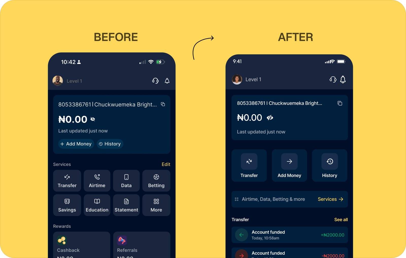
BEFORE / AFTER
Two screens side by side. Left is the current Moniepoint home. Right is the redesign. The redesign answers one question first. What is my balance and what can I do right now.
DESIGN PROCESS
Six stages, each with its own deliverable. Discovery surfaced the real conditions of use. Framing turned observations into a problem worth solving. Strategy set the principles. Wireframes tested the structure before any visual work. Outcomes mapped each change to a measurable behaviour. UI and systems delivered the final pixels and the scalable components behind them.
THE PROBLEM I SET OUT TO SOLVE
Moniepoint has good infrastructure. The features exist. But the product was designed for a user with stable internet, high English literacy, and time to explore. A large portion of the actual user base is none of those things at once. The real problem is not the UI. It is that the product does not adapt its feedback, language, or information density to the conditions in which it is actually used. Merchants are transacting in markets, on cheap Android devices, on 3G, with a customer standing in front of them. Every second of confusion is a second of visible incompetence.
THE OPPORTUNITY
I identified a gap between what Moniepoint promises and what merchants actually experience at the moment of use. The infrastructure is solid. The features exist. But the product was not designed for the conditions Nigerian merchants operate in every day. Moniepoint was positioned to close that gap by becoming the most trusted transaction experience in the market. Not just the most capable one. Instead of a product that works in theory, merchants needed a product that works on 3G, on a Tecno device, in a busy market, with a customer watching.
COMPETITORS ANALYSIS — WHERE MONIEPOINT STANDS
Five capability dimensions, four competitors. The benchmark shows Moniepoint leading on network status alerts but lagging on transfer steps, contact sync, and in-app dispute resolution. The redesign targets the columns where the gap is widest.
| FEATURE | MONIEPOINT | PALMPAY | OPAY | KUDA |
|---|---|---|---|---|
| Transfer Steps | 5–6 | 3–4 | 5–6 | 5–6 |
| Network Status Alert | YES | NO | PARTIAL | NO |
| Contact Sync | NO | YES | YES | NO |
| In-App Dispute Flow | PARTIAL | NO | STRONG | PARTIAL |
| Fee Transparency | MODERATE | YES | CLEAR | MODERATE |
WHAT I FOUND WHEN I STUDIED HOW THIS PRODUCT IS REALLY USED
I conducted remote user interviews with 12 active Moniepoint personal app users, ran a full competitor audit across OPay, Palmpay, and Kuda, and analysed publicly available app store reviews and support feedback. I used Mixpanel behavioural patterns and screen flow analysis to identify where users were dropping off and why. Research only has value when it drives a decision.
MY ROLE
I led the entire design process for this project. I defined the problem frame, designed the research approach, mapped the core merchant flows, created the before and after screens for all four focus areas, and contributed scalable components to the design system to support future product growth across Moniepoint's expanding service categories.
REDESIGN — WHAT I CHANGED AND WHY
Four screens. Each one targets a specific failure in the existing product. Left is the real app. Right is my redesign. The reasoning sits below every pair.
SCREEN 01 — ONBOARDING & KYC
The first thing a new user hits when they sign up.
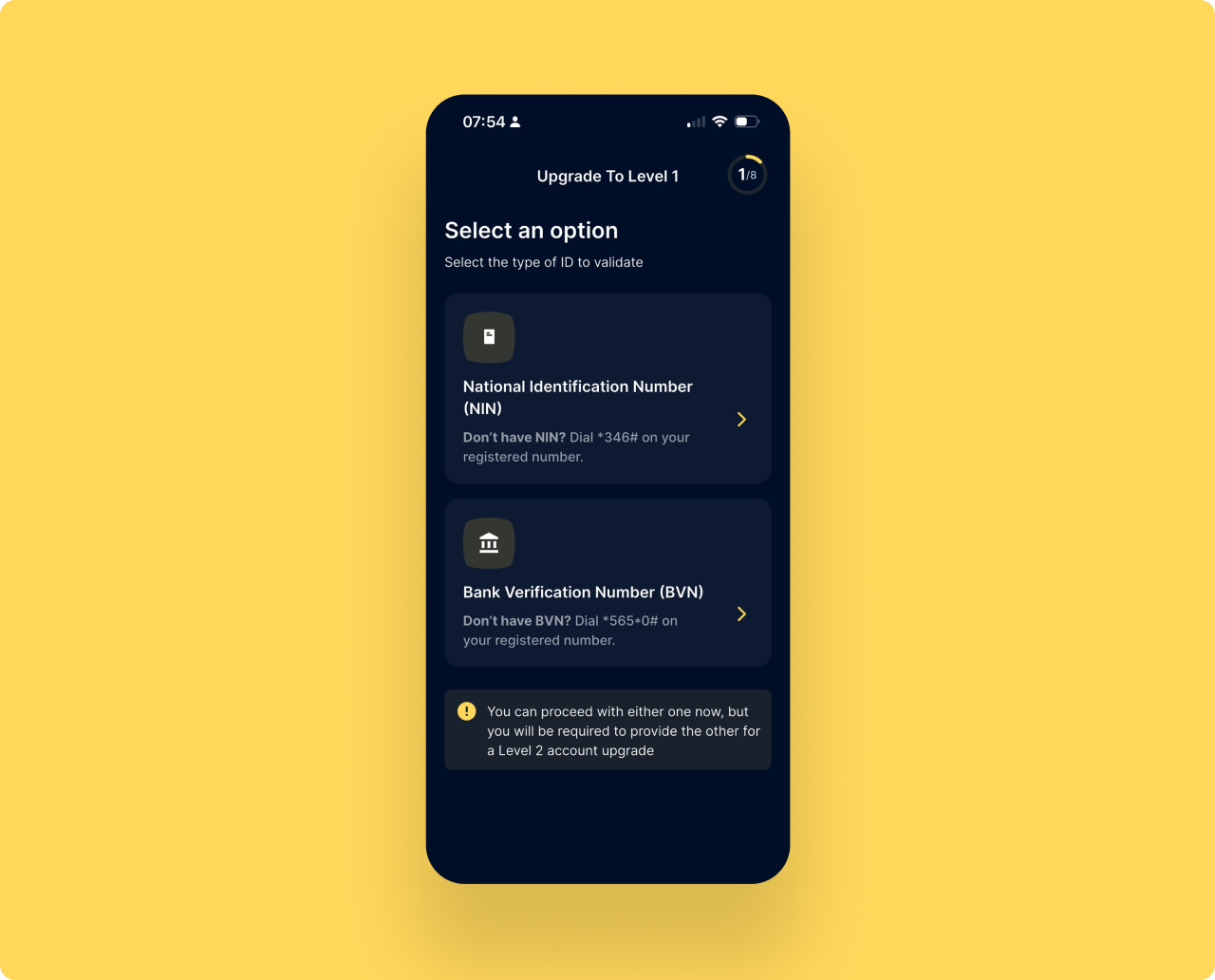
Verification is step 1 of 8 before the product does anything
The first screen asks for NIN or BVN. The product has not shown its value once. Users are asked to invest trust before they have a single reason to.
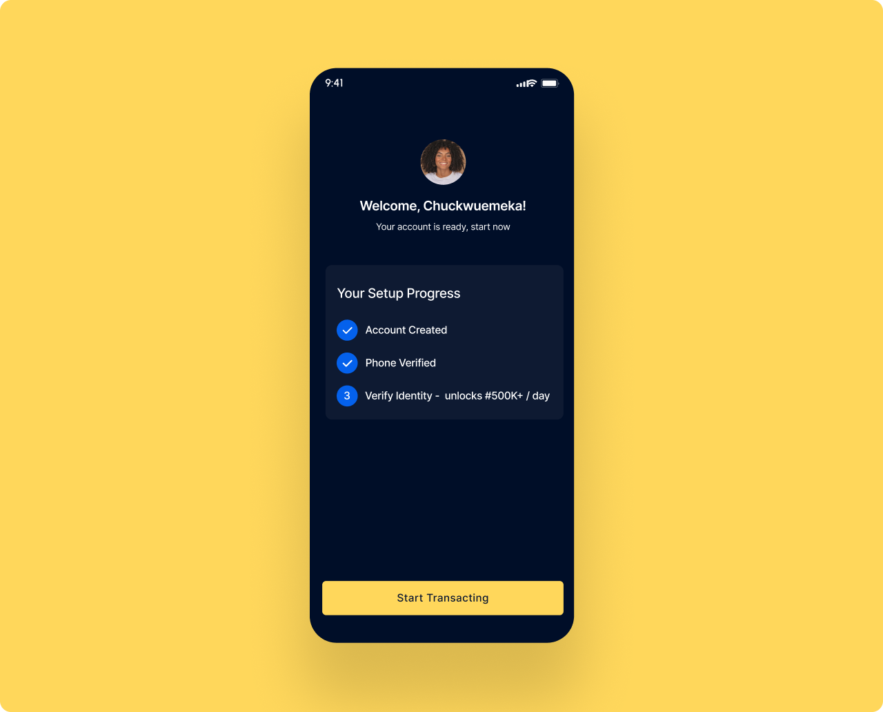
Account active first. Verification becomes an upgrade not a gate.
The welcome screen confirms the account is ready and shows setup progress. Two steps are already done. Verify Identity is step 3, framed as unlocking higher limits. The user starts transacting immediately.
More users activate. More users complete verification.
A user who transacts before verifying has a reason to return and complete the process. Framing verification as upgrade rather than a requirement significantly increases completion rates.
SCREEN 02 — TOOLTIPS
The tooltip layer is the bridge between the old product and the new one. When the home screen restructures, returning users do not know where things went. I designed a two-step coach mark sequence that anchors directly to the elements that changed. Tooltip 1 sits on the balance card, explaining that balance is now the hero and updates in real time. Tooltip 2 sits on the Services row, telling the user that Airtime, Data, Betting and the rest moved here, not away. Both dismiss on tap and never appear again. The system is built as a reusable component so the same pattern can guide users through any future restructure without writing new code.
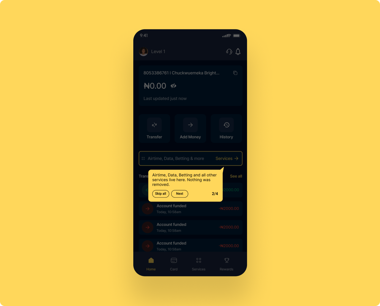
Returning users lose orientation when a familiar product changes shape
A returning user opens the app expecting the old layout. The grid is gone. The icons moved. Without a guide, the user assumes features were removed, not relocated. That assumption is the trigger for an uninstall.
Two tooltips, anchored to the elements that changed, dismissible in two taps
Tooltip 1 anchors to the balance card and explains that balance now updates in real time and the eye icon toggles visibility. Tooltip 2 anchors to the Services row and confirms that Airtime, Data, Betting and the rest are still here, just one row down. Both follow the same shape, same dismiss behaviour, same writing voice. Built as a reusable design system component, not a one-off.
Transition anxiety resolved in two taps. No support tickets. No uninstalls.
The tooltip layer turns a structural redesign from a risk into an upgrade. Returning users feel oriented within seconds. New users never see the tooltips, since the home screen is already structured for them. The same component scales to every future change in the product.
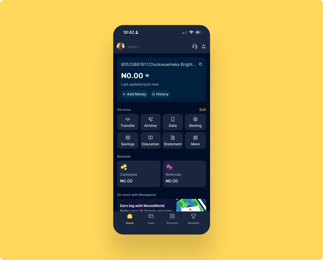
SCREEN 03 — HOME SCREEN REDESIGN
Balance first. Three actions. Everything else one tap away.
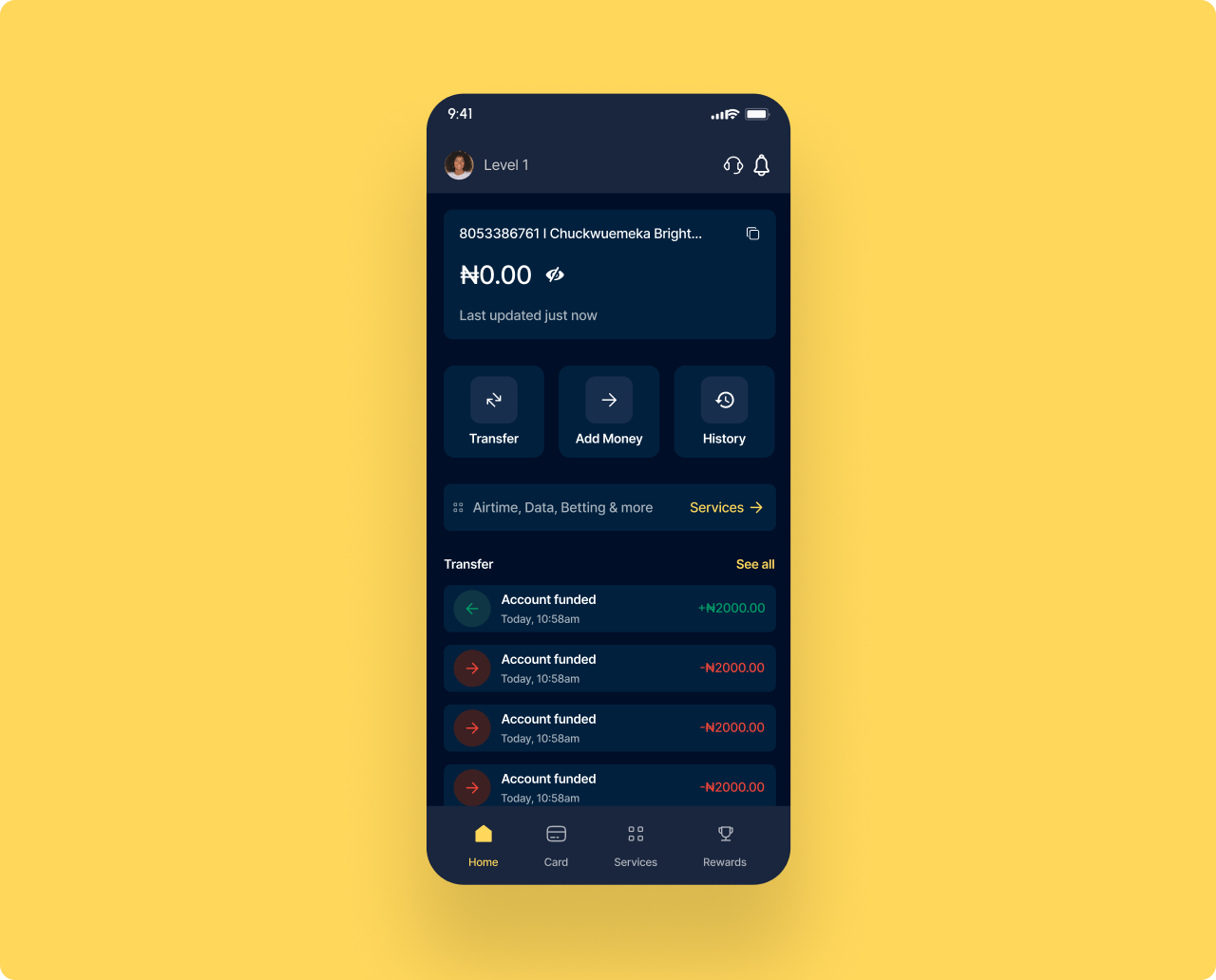
8 services, rewards, and a promo banner all compete with the balance
Everything sits at equal visual weight. Transfer is icon 1 of 8 in a grid. A user who opens the app to send money has to scan the entire screen before they can act.
Balance is the hero. Three actions replace the 8 icon grid.
Transfer, Add Money, and History sit large and within thumb reach. A slim services row gives access to Airtime, Data, Betting and more with one tap. Rewards and promos move to their own tabs. Nothing removed.
Faster to act. Cleaner to read. Easier to trust.
A user who reads their balance in 2 seconds and starts a transfer in 3 is a user who trusts the product. Reducing time from app open to primary action directly improves daily engagement and retention.
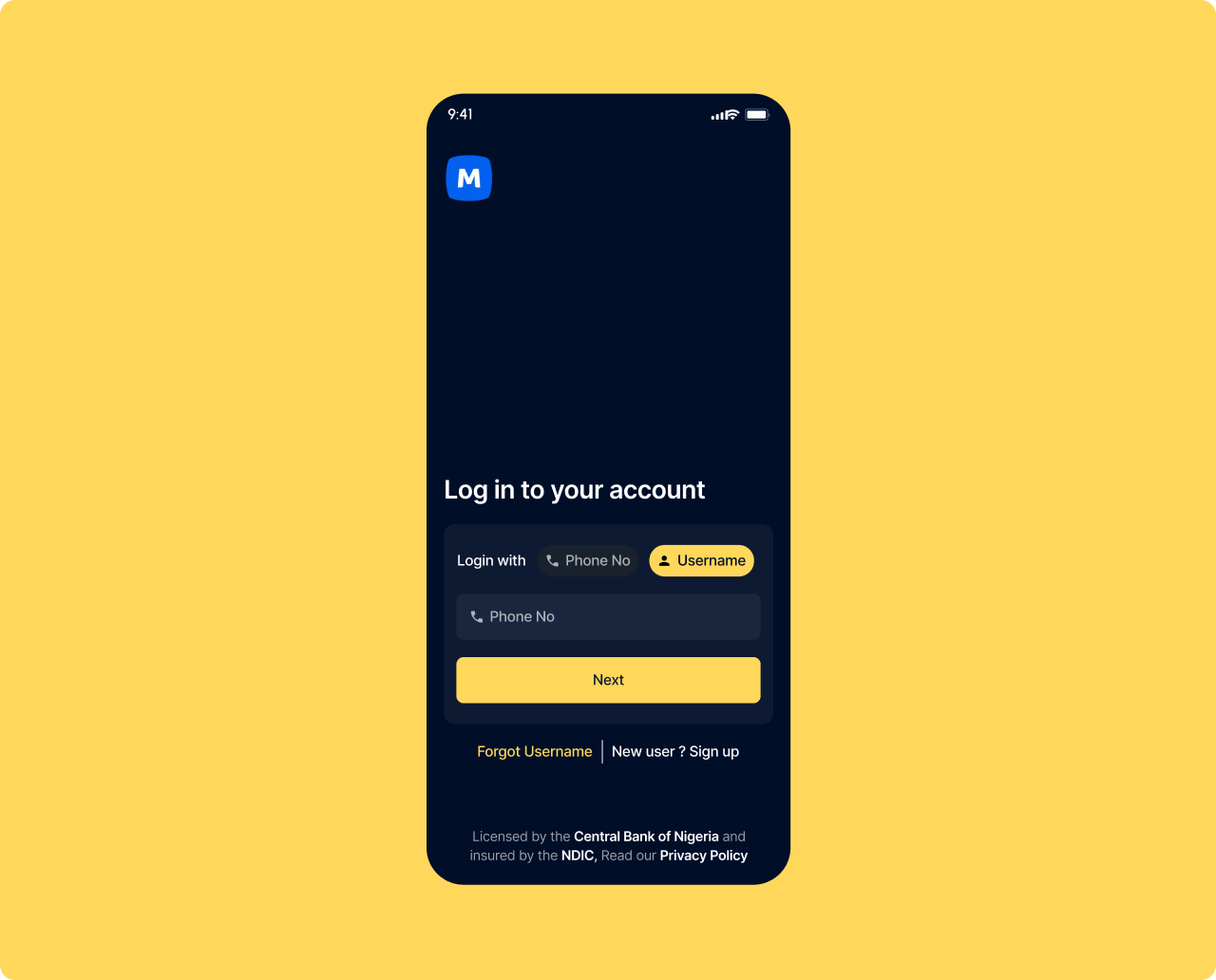
SCREEN 04 — LOGIN SCREEN
The entry point for every user. It must work for returning users and new ones equally.
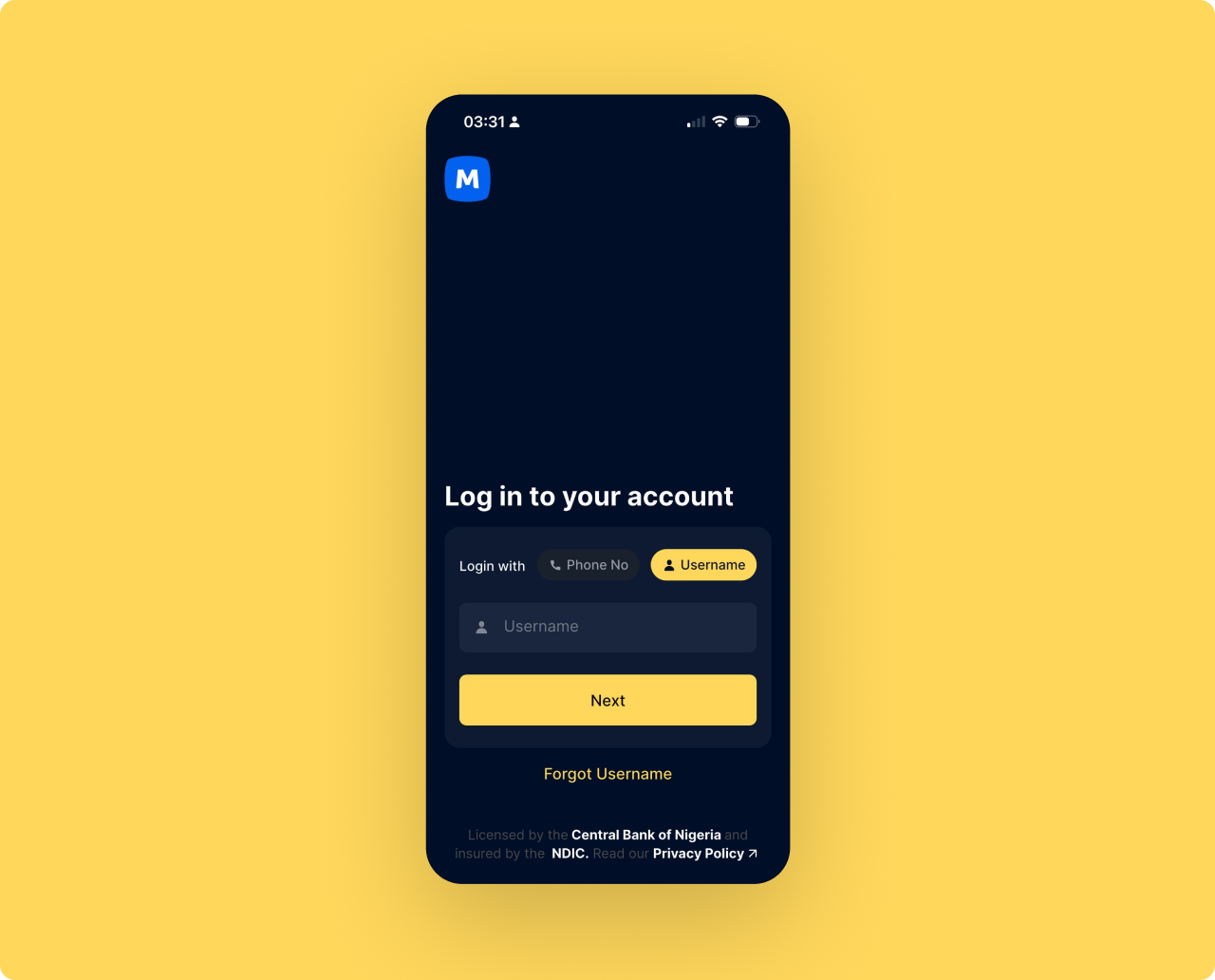
New users who land here by mistake have no way forward
The login screen has no sign up link. A new user who downloads the app and taps Log In by mistake is completely stuck. There is no exit. The only option is to force close and try again.
One line added. New user? Sign up — next to Forgot Username.
A single text link sits beside Forgot Username at the bottom of the form. It costs nothing visually and gives every new user a clear path forward without disrupting the login experience for returning users.
Recovers silent drop-off before first activation.
A user who downloaded the app but could not figure out how to sign up is a lost acquisition. This change catches that moment. Small addition, direct impact on new user conversion from download to first session.
WHAT I EXPECT TO MOVE AND WHY IT MATTERS TO THE BUSINESS
Every number is tied to a specific design decision. All would be validated through instrumented A/B testing in a phased rollout.
WHAT I LEARNED AND WHAT I WOULD VALIDATE NEXT
The most important discipline in this project was knowing what not to redesign. Moniepoint has a strong product. The gaps are not capability gaps. They are context gaps. Designing for Nigeria means designing for users transacting under social pressure, on variable connectivity, at a counter with a customer watching. I also learned that in fintech, users do not just need things to work. They need to feel that they work. The emotional layer is where most product teams stop looking. It was where I found the most impactful changes in this project.