PROJECT OVERVIEW
NextMatchUp is an early stage social platform preparing for launch, focused on helping people form meaningful real world connections in an increasingly disconnected digital landscape. This case study documents my pre launch design work and research driven approach to understanding how structured, intentional meetups can reduce social anxiety and build trust.
Over five months, I explored the problem space through user research, competitive analysis, and iterative design. The work shown here reflects approved product direction and design decisions made in collaboration with stakeholders during the pre launch phase, with the goal of translating digital intent into real world connection while prioritizing clarity, comfort, and emotional safety.
PROJECT TYPE
UX UI, Branding, Case Study
TIMING
6 Months
ROLE
Lead UX UI Designer, Researcher
TOOLS
Figma, Miro, FigJam, Notion
DESIGN PROCESS
PROBLEM
People across major cities, especially newcomers, expats, and travelers, experience increasing levels of loneliness and emotional isolation. While digital communication is at an all time high, real world connection continues to decline. Existing platforms do not provide a safe, structured, or emotionally intelligent way for people to meet, collaborate, or form meaningful relationships offline. Users need a solution that reduces social anxiety, simplifies meeting new people, and builds trust from the first interaction.
PROJECT GOAL
The final solution is a human centered product built around simplicity, intention, and guided social experiences. Through research, UX strategy, and consistent visual design, NextMatchUp introduces a category driven system that removes guesswork and aligns users with the type of connection they seek. With minimal chat, small group meetups, and thoughtful interaction design, the platform encourages real world engagement while maintaining safety, clarity, and emotional comfort.
SOLUTION
The final solution is a human centered product built around simplicity, intention, and guided social experiences. Through research, UX strategy, and consistent visual design, NextMatchUp introduces a category driven system that removes guesswork and aligns users with the type of connection they seek. With minimal chat, small group meetups, and thoughtful interaction design, the platform encourages real world engagement while maintaining safety, clarity, and emotional comfort.
COMPETITORS ANALYSIS
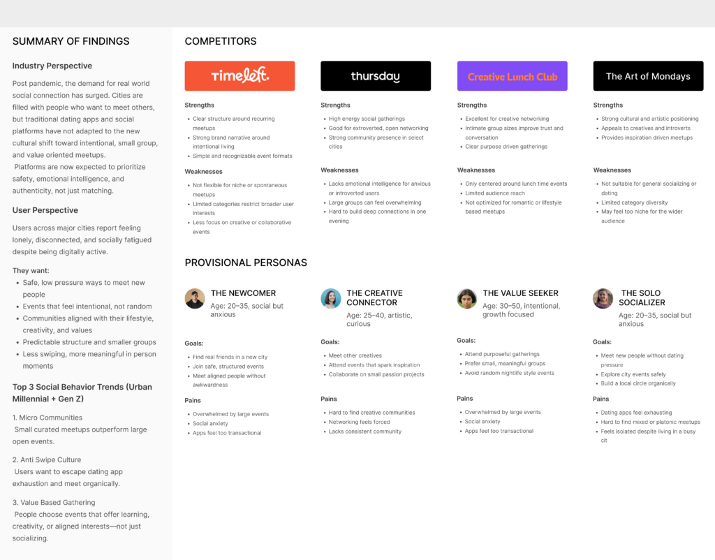
The decision to begin with a competitive analysis helped establish a clear understanding of the real life meetup landscape and the platforms currently shaping how people connect offline. By examining competitors like Time Left, Thursday Event, Creative Lunch Club, and Art of Monday, I was able to identify their strengths, weaknesses, and the gaps users consistently experience when trying to form meaningful in person relationships.
RESEARCH PLAN + INTERVIEWS
The decision to begin with a research plan helped establish a clear understanding of user motivations, emotional barriers, and connection behaviors. By structuring the plan before conducting interviews, I ensured clarity, consistency, and focused discovery throughout the process.
RESEARCH PLAN OVERVIEW
The user interview process began with developing a structured research plan, which entails:
- Project Background & Problem
- Research Goals
- Research Objectives
- Research Questions
- Methodologies
- Hypothesis
- Timeline
USER RESEARCH PLAN: NEXTMATCHUP
Problem
People across major cities feel disconnected and socially overwhelmed. While digital communication grows, real-life connections decrease.
Background
Many people want to meet others but feel anxious or unsure where to begin. Traditional apps focus heavily on chatting instead of real-life connection.
Research Goal
To understand motivations behind attending meetups and the emotions tied to trust and belonging.
RESEARCH INTERVIEW SCRIPT
Interview Goals
• Learn how people discover meetups • Understand emotional barriers • Explore comfort levels with small-group interactions
Introduction
Explain purpose, ask permission to record, build trust.
Key Questions
- How do you currently meet new people?
- What emotions do you feel when attending events?
- What makes a meetup feel safe?
- What types of activities interest you?
- What keeps you from attending certain events?
USER PERSONA
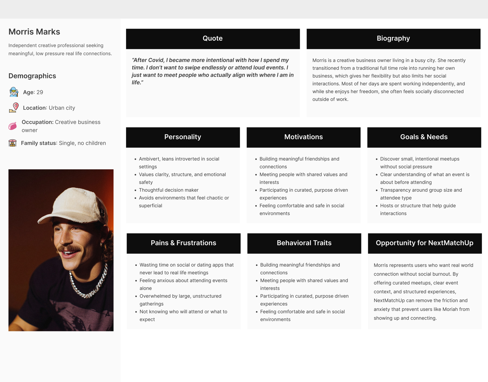
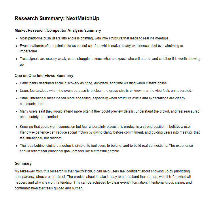
Based on my user interviews, I identified two key findings: the user’s motivations and the user’s needs. These insights were central to creating the persona and informed the overall direction of the project.
RESEARCH KEY FINDINGS
I asked for understanding. I asked the right questions and took an empathy driven approach to align with my users’ behaviors, motivations, and pain points. With these insights, I was able to begin shaping a solution and move forward with testing my assumptions.
KEY FINDINGS
- Providing clarity and emotional reassurance throughout the process of discovering and attending meetups. Users want transparency around event purpose, group size, and expectations. The experience should feel guided and intentional, similar to having a trusted host present rather than navigating social situations alone.
- Creating an approachable and welcoming experience that removes the pressure typically associated with social and networking events. A lighter, human centered tone helps reduce anxiety and makes participation feel more accessible, especially for users who feel overwhelmed by large or unstructured gatherings.
DEFINE PHASE
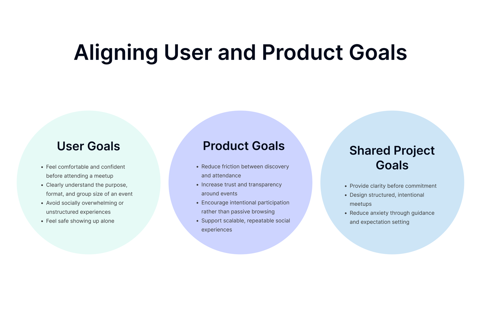
To stay focused, I evaluated the project through the lens of overlapping user and business goals. Research showed that while users want real-world connection, they also need reassurance, clarity, and emotional safety before committing to social experiences. At the same time, the product must encourage engagement, trust, and repeat participation.
Providing clarity and emotional reassurance throughout the process of discovering and attending meetups. Users want transparency around event purpose, group size, and expectations. The experience should feel guided and intentional, similar to having a trusted host present rather than navigating social situations alone.
Creating an approachable and welcoming experience that removes the pressure typically associated with social and networking events. A lighter, human centered tone helps reduce anxiety and makes participation feel more accessible, especially for users who feel overwhelmed by large or unstructured gatherings.
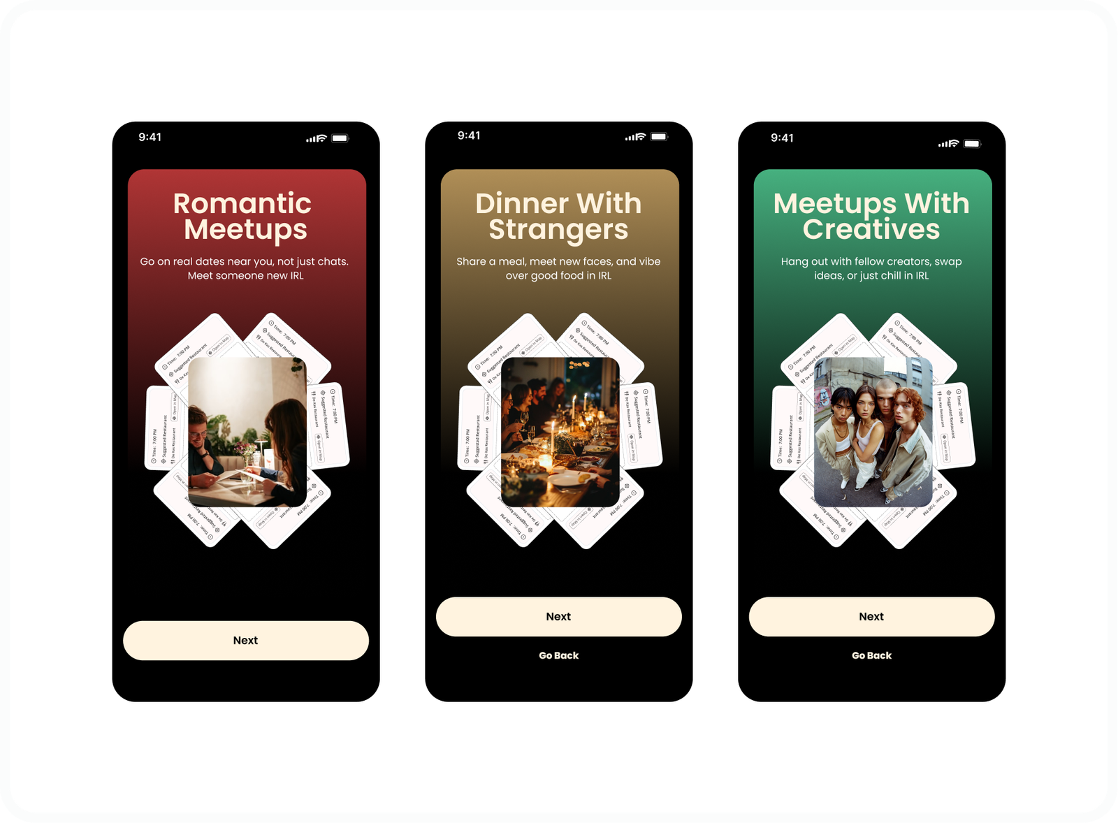
CORE LAUNCH FEATURES
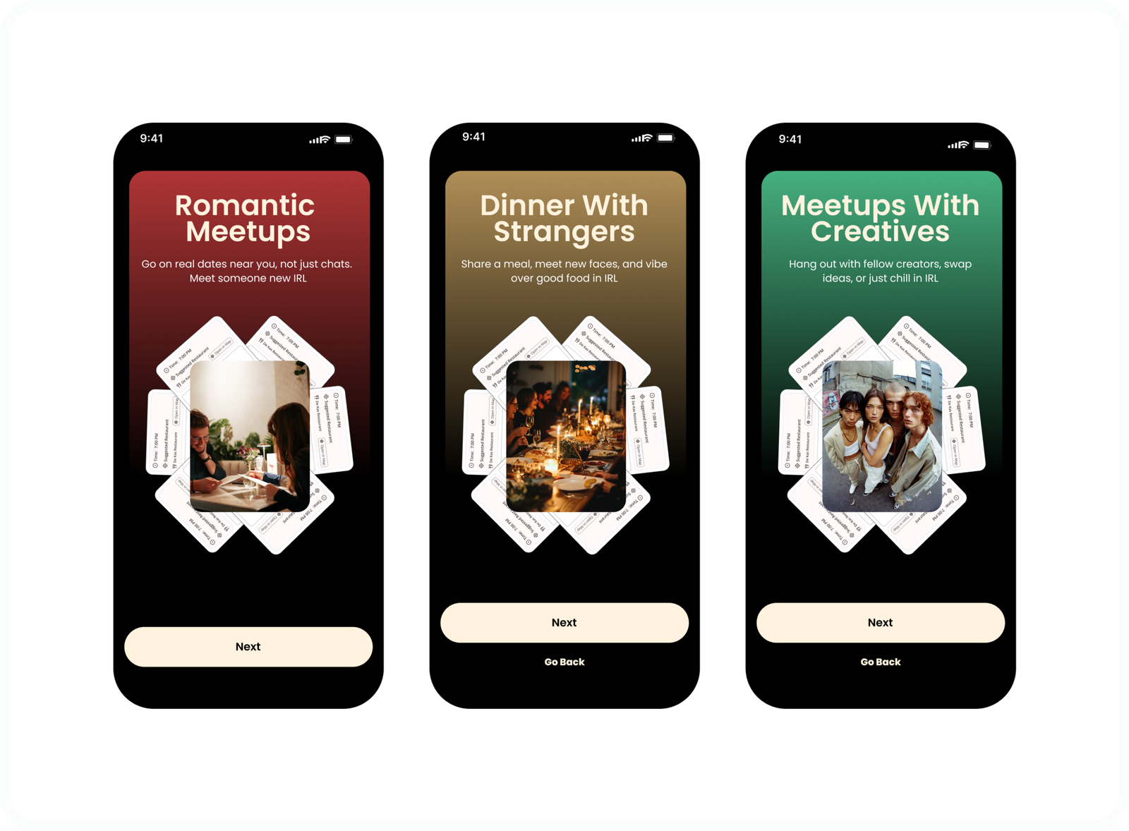
CORE FEATURES
To ensure NextMatchUp launched with a focused and realistic scope, features were prioritized based on approved product architecture, user research, and launch readiness. These features represent the core experience required for the initial release, designed to support trust, clarity, and real-world connection.
IDEATE
Ideation is where ideas are explored, assumptions are challenged, and structure is created. It lays the strategic foundation that guides design decisions, user flows, and functionality throughout the rest of the project.
WHAT THIS ENTAILS
- Sitemaps
- User Flow
- Lo – Fi Wireframes
- Hi – Fi Wireframes
SITEMAPS
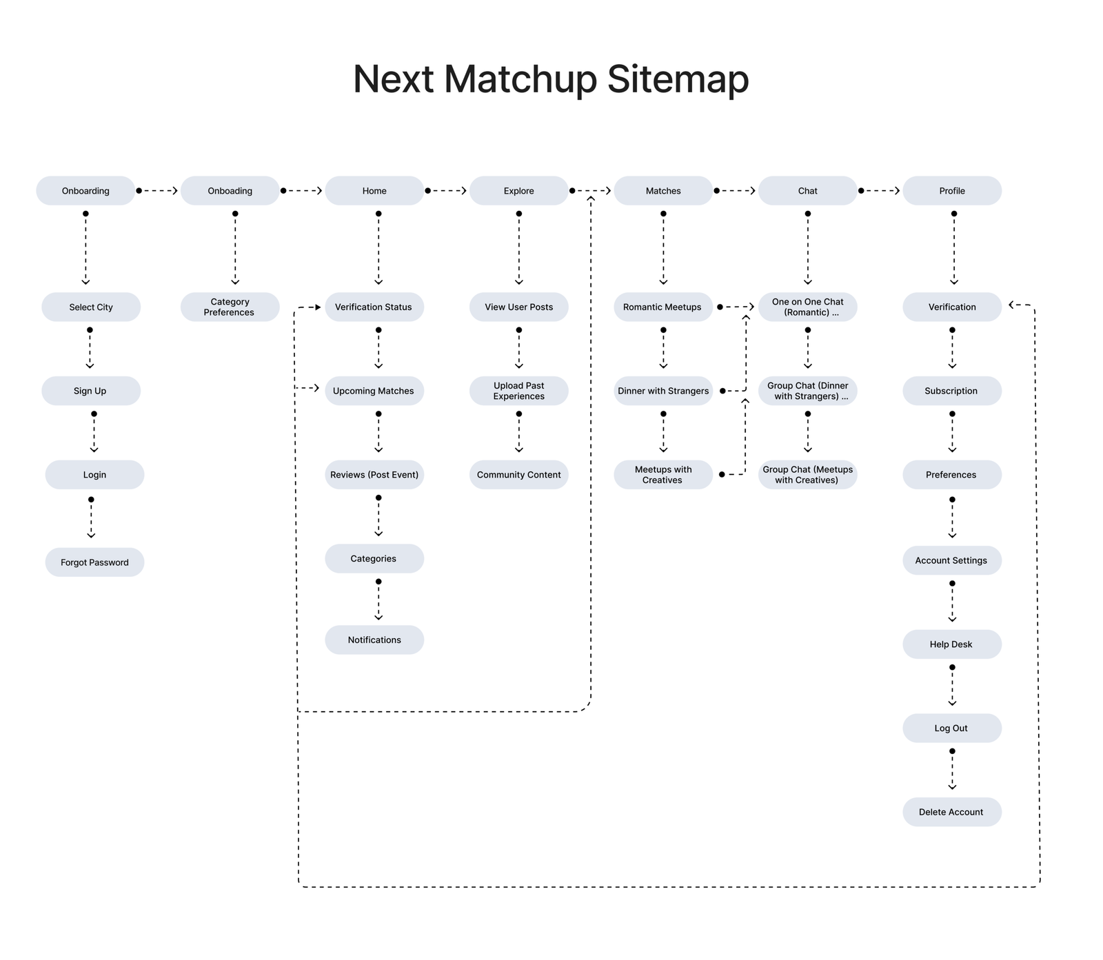
By defining categories and their relationships early, the site map established a solid foundation for scalable navigation and helped align functionality with user expectations across multiple sections of the app.
USER FLOW
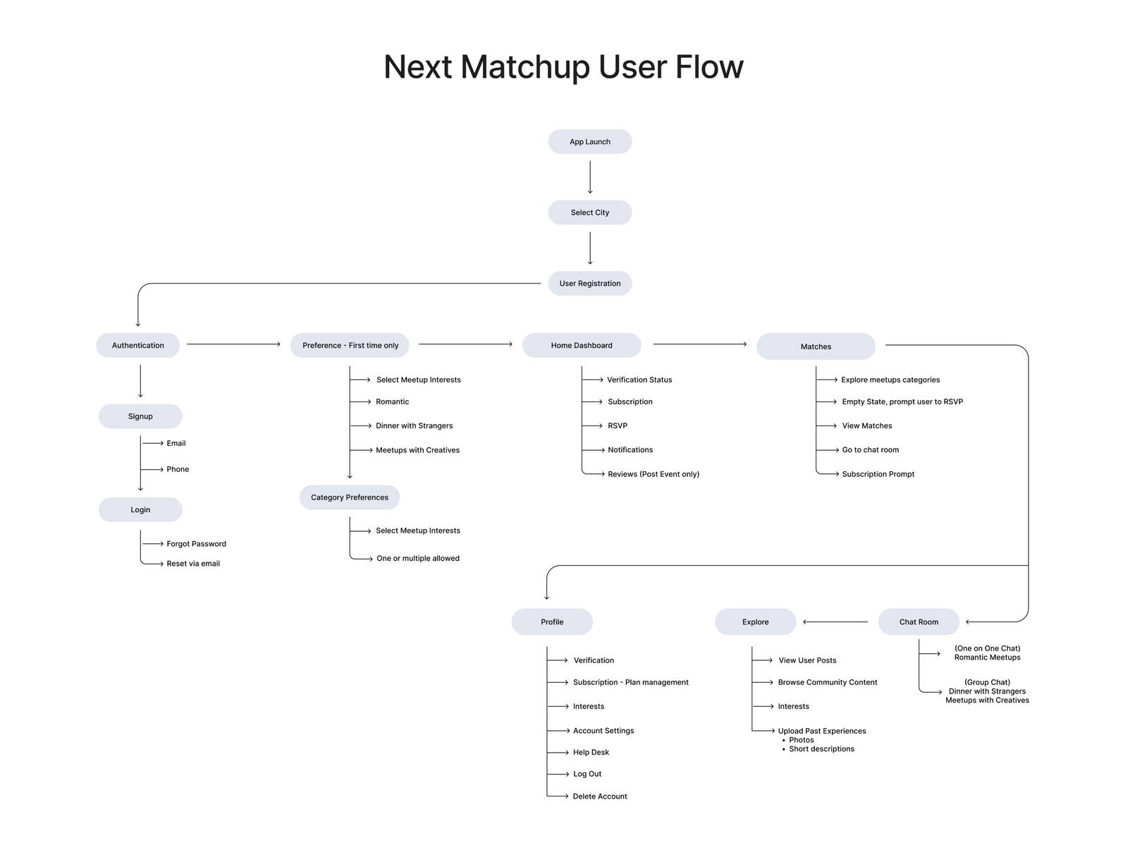
MORE DETAILS
The user flow was designed to map out each key step a user takes within the app, from onboarding to completing core actions. By structuring the flow into clear progression stages, it ensures users move through the experience intuitively without friction.
Lo-fi Wireframes
MORE DETAILS
I began the wireframing process with low fidelity sketches using paper and pencil, starting from the desktop experience. This allowed me to quickly explore layout options, define key components, and clearly label each element before moving into digital tools.
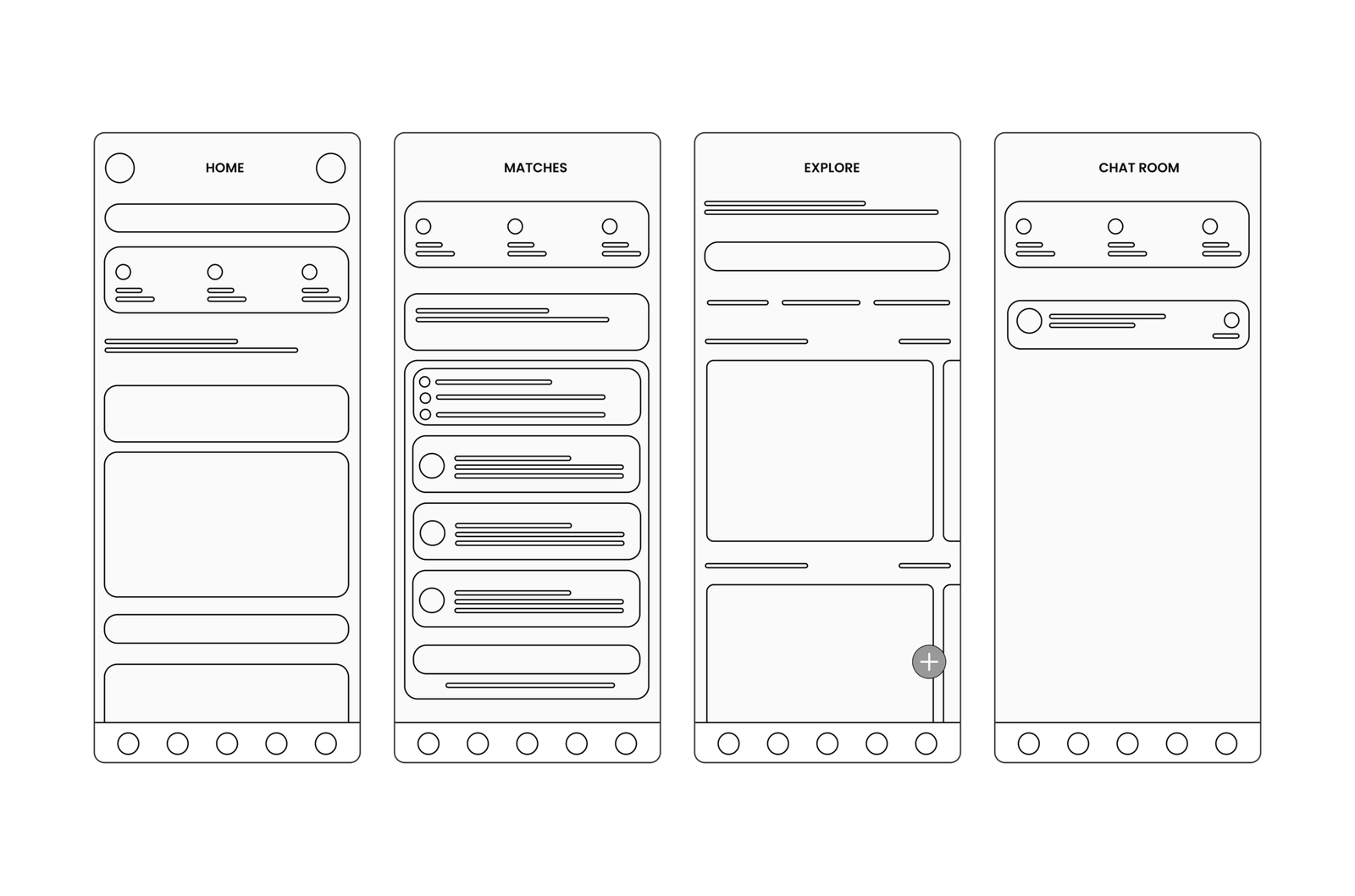
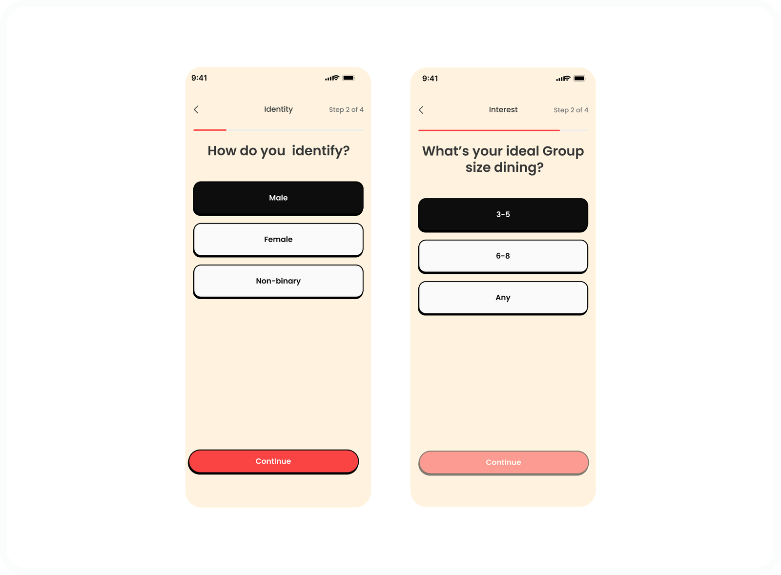
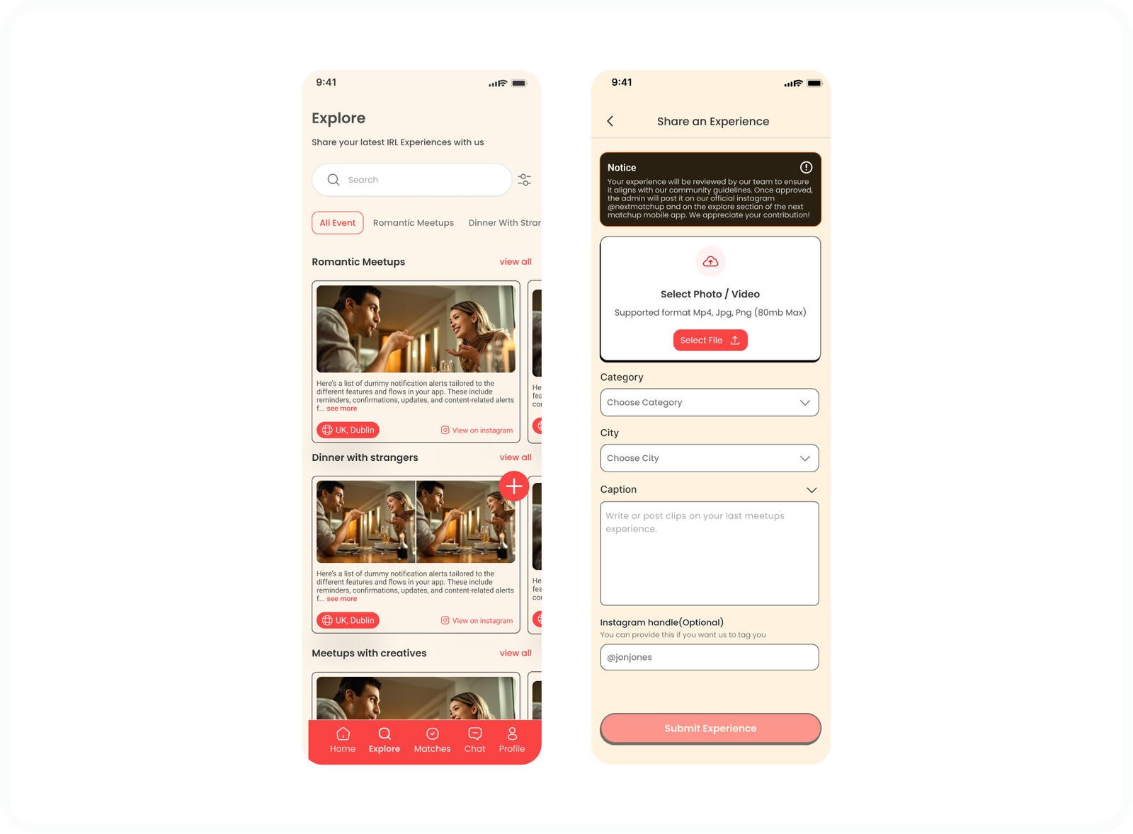
HI - FI WIREFRAMES
The high fidelity wireframes were designed specifically for mobile, focusing on clarity, speed, and ease of interaction. Each screen was crafted to support natural thumb reach, clear visual hierarchy, and intuitive navigation, ensuring users can move through the experience effortlessly.
SPLASH SCREEN
ONBOARDING
HOME
EXPLORE
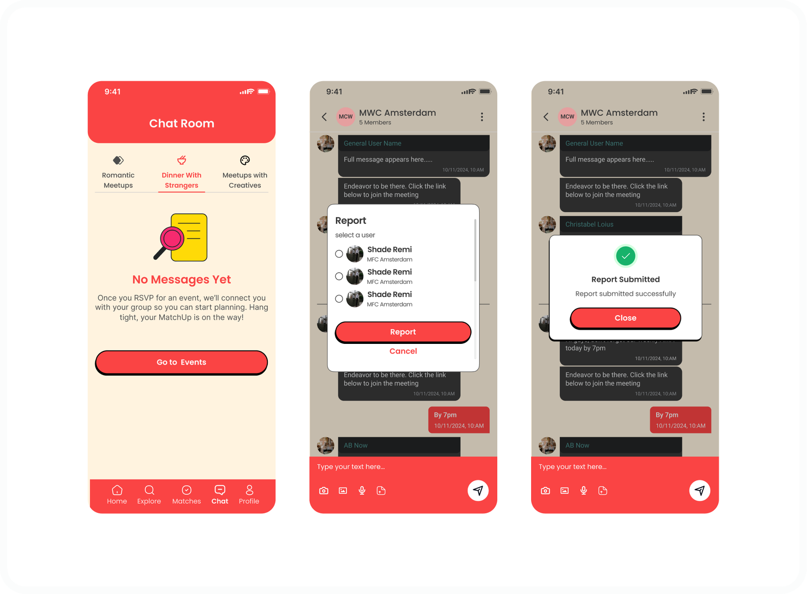
CHAT
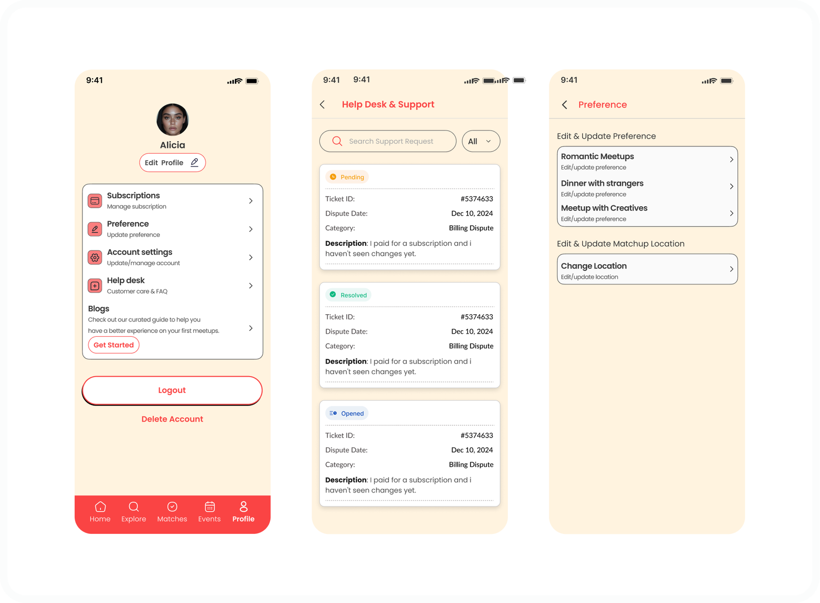
PROFILE
USER TESTING
USABILITY TESTING NOTES
- Clear category intent helped users quickly understand why they were matching
- Users felt more comfortable engaging when profiles felt structured and purposeful
- Guided prompts reduced friction when starting conversations
- A clean layout helped users focus on people instead of features
- Users wanted reassurance about what happens after a match
- Better explain how NextMatchup differs from dating or social feeds
- Surface safety guidance and expectations earlier in the flow
- Highlight why matches were suggested to build confidence
- Simplify onboarding to reduce early drop off
- Clarify next steps after matching to encourage action
MORE DETAILS
After completing usability interviews, insights were organized using affinity mapping to identify recurring patterns and themes across participant feedback. Notes from each session were grouped based on shared behaviors, concerns, and motivations, allowing patterns to emerge naturally without imposing assumptions.
AFFINITY MAPPING
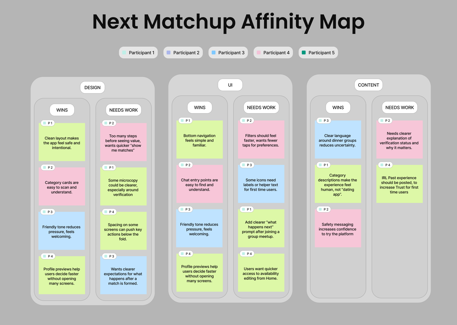
Priority Revisions
The high fidelity wireframes were designed specifically for mobile, focusing on clarity, speed, and ease of interaction. Each screen was crafted to support natural thumb reach, clear visual hierarchy, and intuitive navigation, ensuring users can move through the experience effortlessly.
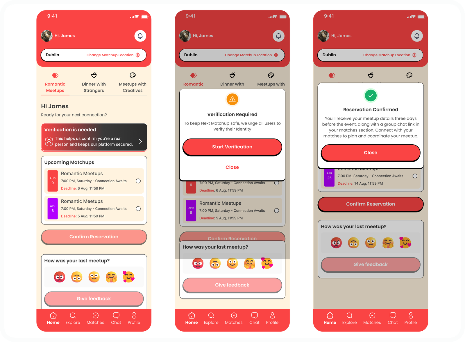
VERIFICATION SCREEN
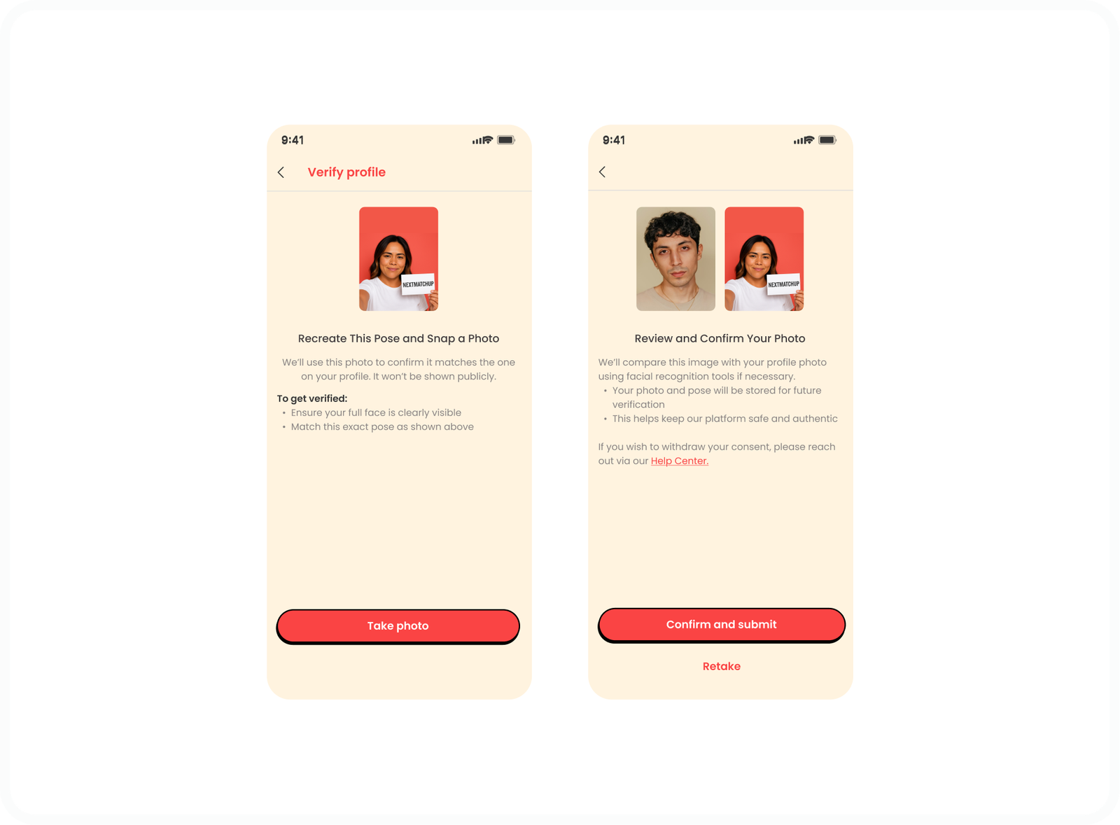
AFTER USABILITY TESTING AND FEEDBACKS, WE MADE A SECTION FOR USERS TO VERIFY THEM SELVES BEFORE THEY COULD BOOK AN IRL MEETUP
WAITLIST
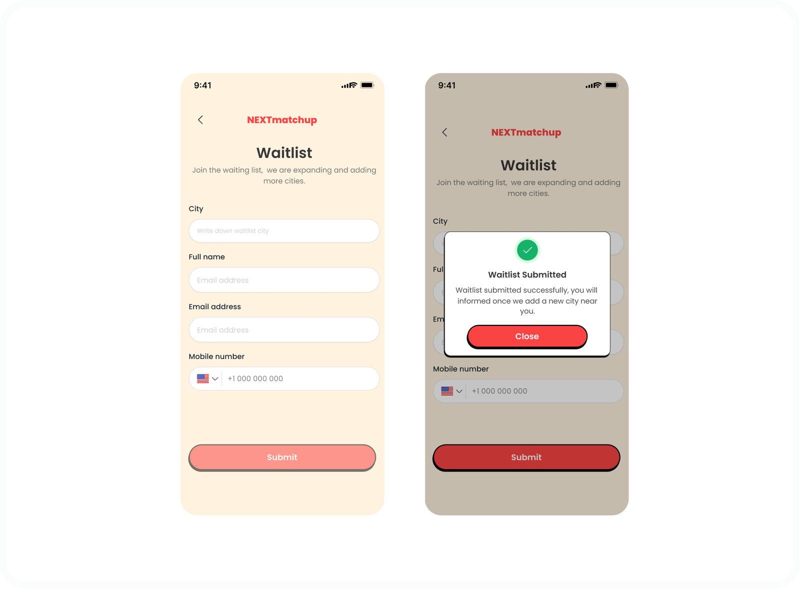
AFTER USABILITY TESTING AND FEEDBACKS, WE MADE A SECTION FOR USERS WHO'S CITY WASN'T LISTED. THEY FILLED UP THE WAITLIST FORM, AND WE CAN CONSIDER ADDING THAT CITY BASED ON POPULR DEMANDS
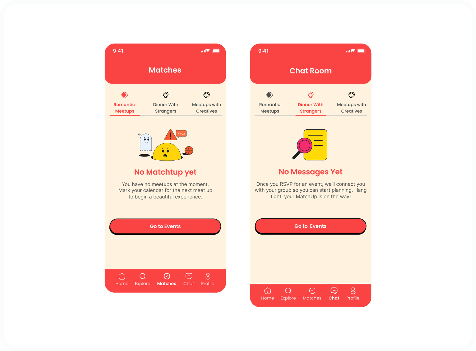
EMPTY STATE